
Welcome
1. What is Dashbuilder
Dashbuilder is a tool for creating dashboards and data visualizations for developers and non-technical users. Dashboards can be created using pure YAML or you can reuse some of the existing dashboards to monitor your service or application.
2. Concepts
In this section we explore the concepts used by Dashbuilder.
2.1. Pages
Pages is where the data visualization lives. It follows a grid approach for organizing the visualization which means that it is organized in rows, columns and components; columns can have their own rows and columns. It is also possible to modify the CSS properties of each page part.
2.2. Navigation
Navigation is an optional component and it is about the relationship between pages. When you have more than one page then a menu is displayed with all pages, you can organize this menu. Furthermore, navigation is the key for embedding pages inside each other.
2.3. Datasets
DataSets are the source of your data. It can come from any JSON/CSV accessible file or you can declare it inline for a static dataset.
More than loading from a source of data, dashbuilder datasets can be cached and later be spliced, filtered, ordered and grouped for a specific visualization.
2.4. Components
Components are the front ends for static content, data visualization or a navigation component:
-
Static components are used for visualization that does not require a dataset. Examples are HTML and forms.
-
Data Visualization components are offered natively by dashbuilder and they can be charts, filters or text that shows some aggregate information from the dataset.
-
Supported charts are bar, area, line, pie, donut and map.
-
-
Filters can be presented as labels or a drop down selector
-
The metric component uses HTML and JS templates to show a grouped dataset information
| These components offer multiple options, such as auto refresh, title, margin and others. |
-
Navigation components allow you to embed other pages using different ways: Tabs, carousel, tiles, menu and tree navigation.
2.5. External Components
External components are like components, but the code used to build it will run in an isolated container (currently an iframe). It means that with external components it is possible to use any web technology to represent a dataset, users just know how to use the external components Javascript API.
3. Authoring Dashboards
3.1. YAML and JSON
Dashboards are created using YAML format where you declare datasets, pages and its blocks of visualization. Dashboards created with YAML run in client-only Dashbuilder installation accessing JSON/CSV datasets.
To get start with YAML check out the YAML Guide in this documentation and our online samples.
The code from the YAML Guide can be tried on our online editor!
3.2. Tooling
To create your dashboards you can use our online editor or the VSCode editor extension.
4. Deployment
Deploying dashboards for Dashbuilder is achieved by simply copying its static content to a web server or you can embed it in your application using an iframe.
4.1. Using Dashbuilder Web Application
Dashbuilder static content is published on NPM package @kie-tools/dashbuilder-client. You can add it a dependency for your project and then copy the static content to your application.
For example, the following package.json will include Dashbuilder bits when using npm run build and allow users to run dashbuilder locally using npm run server
{
  "name": "dashbuilder-webapp",
  "version": "0.0.0",
  "description": "Dashbuilder WebApp",
  "scripts": {
    "bootstrap": "npm install",
    "clean": "rm -rf dist/",
    "copy:dashbuilder": "cp -r node_modules/@kie-tools/dashbuilder-client/dist/* dist/",
    "copy:sources": "cp -r static/* dist",
    "build": "npm run clean && mkdir dist/ && npm run copy:dashbuilder && npm run copy:sources",
    "server": "npm run build && cd dist && http-server -p 8000"
  },
  "devDependencies": {
    "@kie-tools/dashbuilder-client": "^0.28.0",
    "http-server": "^14.1.1"
  }
}
In the directory static you should place your dashboards and the configuration file setup.js.
4.2. Configuration
In Dashbuilder webapp root directory there’s a javaScript file setup.js where users can configure the list of dashboards, the mode (development or client) and samples.
dashbuilder = {
  /*
		  // possible modes are EDITOR and CLIENT - if dashboards is set then CLIENT mode is assumed
		  mode: "CLIENT",
		  // The list of client dashboards - if CLIENT mode is used and no list is provided, than the dashboard "dashboard.yml" will be attempted to load. If no dashboard is found, then client opens for upload.
		  // The dashboard can also be an URL
		  dashboards: [ "dashboard1.yaml", "dashboard2.json"],

		  // base path to look for dashboards. Default is /
		  path: "/path",

		  // if true, then model from external urls will be allowed
		  allowExternal: true,

		  // A base URL for the samples repository
		  // if set then dashbuilder tries to retrieve samples.json from root dir and load samples from the provided URL
		  samplesUrl: "/samples",

		  // An URL to resolve sample path on disk. It will receive a GET request with a query parameter called "sampleId"
		  samplesEditService: "edit",

		  // If true then samples is used as the default page when no model is selected
		  samplesDefaultHome: true
	  */
};
4.3. Cloud Deployment
From the online editor you can deploy your dashboards to Openshift. This is explained on our blog.
Users can also create a custom image to use with Dashbuilder static content.
4.4. Loading content dinamically
Dashbuilder can run as an editor by simply setting the mode as EDITOR, then you can send content to be rendered using a global Javascript function setDashbuilderContent or use window.postMessage to the iframe where Dashbuilder is running. Here’s a sample Javascript code:
// flag to indicate that dashbuilder is ready for content;
var ready = false;
window.addEventListener("message", (e) => {
  if (e.data === "ready") {
    ready = true;
  }
});

// Updates dashbuilder with the content (only if it is ready)
const send = () => {
    if (ready) {
        document.getElementById("dbFrame").contentWindow.postMessage(ymlContent, null);
    }
};
5. Dashbuilder YAML Guide
This is a guide for creating dashboards and visualizations with YAML. You can run all examples with Dashbuilder YAML Online Editor.
5.1. Pages
A dashbuilder YML file should contain at least one page, hence this is the smallest YML that you can create (it renders a white page):
pages:
    - name: Hello
A page can contain rows, columns and finally components. A page with a single row and column can have the rows and columns omitted. Here’s a page with a single component, which renders the text Hello:
pages:
    - components:
        - html: Hello
It is required to declare rows and columns for a more complex layout. Here’s a page with two text in separated columns:
pages:
    - rows:
        - columns:
            - span: 6
              components:
                - html: Row 1 Column 1
            - span: 6
              components:
                - html: Row 1 Column 2
        - columns:
            - span: 6
              components:
                - html: Row 2 Column 1
            - span: 6
              components:
                - html: Row 2 Column 2
The YML renders to:

The page, rows, columns and components can have properties, including some CSS properties, such as width/height, background color, color and more.
pages:
    - rows:
        - properties:
            background-color: darkgray
          columns:
            - span: 6
              properties:
                color: white
              components:
                - html: Row 1 Column 1
            - span: 6
              properties:
                color: lightblue
              components:
                - html: Row 1 Column 2
A column can also have rows with components, this is useful for more complex layouts:
pages:
    - rows:
        - columns:
            - span: 2
              rows:
                - columns:
                    - components:
                        - html: R1CL1R1
                - columns:
                    - components:
                        - html: R1CL1R2
            - span: 2
              rows:
                - columns:
                    - components:
                        - html: R2CL1R1
                - columns:
                    - components:
                        - html: R2CL1R2
            - span: 2
              components:
                - html: R2CL1R1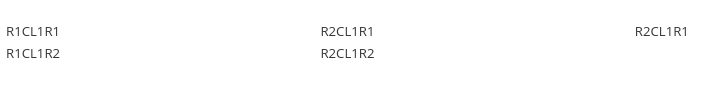
5.2. Datasets
There’s a section for datasets where you declare your source of data. Dashbuilder supports multiple datasets types, but in this document we only cover JSON datasets, which does not require a backend. JSON datasets can have as a source any JSON array with a reachable URL, so the simplest dataset declaration requires the uuid and the url.
datasets:
- uuid: mydataset
  url: /datasets/population.json
pages:
- name: DataSet sample
It is possible to declare inline JSON for testing and prototyping purposes:
datasets:
- uuid: mydataset
  content: >-
            [
              ["William", 33],
              ["Luanda", 32],
              ["Anton", 6]
            ]
pages:
- name: DataSet sample
With a pure JSON array Dashbuilder will try to find the column type and give it a generic ID (Column X). You can override Dashbuilder’s default settings using columns:
datasets:
- uuid: mydataset
  content: >-
            [
              ["William", 33],
              ["Luanda", 32],
              ["Anton", 6]
            ]
  columns:
    - id: Name
    - id: Age
      type: NUMBER
pages:
- name: DataSet sample
The column must have a type which can be LABEL, TEXT, NUMBER or DATE. If no type is provided, then LABEL is used.
In most of the cases, the JSON format is not an array. For these cases it is possible to use the powerful transformation language JSONata to transform a dataset using the expression attribute. In the following example the array of objects is transformed into a JSON array:
datasets:
- uuid: mydataset
  expression: $.participants.[name, age]
  content: >-
            {
              "participants": [
                {"name": "William", "age": 33},
                {"name": "Luanda", "age": 32},
                {"name": "Anton", "age": 6}
              ]
            }
pages:
- name: DataSet sample
It is possible to use caching for non real time datasets. The cache expiration can be configured using refreshTime, otherwise the case is only invalidated when the YML runs again. Here’s an example of a dataset cached for 30 seconds:
datasets:
- uuid: mydataset
  content: >-
            [
              ["William", 33],
              ["Luanda", 32],
              ["Anton", 6]
            ]
  cacheEnabled: 'true'
  refreshTime: '30second'
pages:
- name: DataSet sample
Datasets can have the following fields:
-
Accumulate: It is a new dataset field. When it’s true, Dashbuilder keeps the data on memory on each refresh. It can be limited by maxCacheRows.
-
MaxCacheRows: It determines the number of rows kept in memory when using cache or accumulate. The default value of this field is set to 1000.
-
Headers: A map that is used to set headers that will be sent on the dataset HTTP request.
-
Query A map with query parameters added to the dataset URL
-
Path A path that is used on the dataset URL
5.3. Datasets lookup
To display a dataset Dashbuilder uses the concept of lookup. Imagine the dataset as a pie and lookups as a piece of the pie. With lookup it is possible to select which part of a dataset will be displayed.
The lookup is part of a special component called displayer, which is covered later on this guide. For now, consider only the table displayer.
The simplest use of a lookup is by simply providing the dataset uuid:
datasets:
- uuid: mydataset
  content: >-
            [
              ["William", 33],
              ["Luanda", 32],
              ["Anton", 6]
            ]
  columns:
    - id: Name
    - id: Age
      type: NUMBER
pages:
- components:
    - displayer:
        lookup:
            uuid: mydataset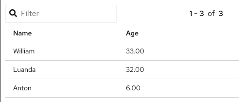
With the lookup it is possible to define the number of rows and the row offset of a dataset:
datasets:
- uuid: mydataset
  content: >-
            [
              ["William", 33],
              ["Luanda", 32],
              ["Anton", 6]
            ]
  columns:
    - id: Name
    - id: Age
      type: Number
pages:
- components:
    - displayer:
        lookup:
            uuid: mydataset
            rowCount: 1
            rowOffset: 2
The field order can be used to order the dataset based on a column. It is required to provide the column id and the sort order (ASCENDING or DESCENDING):
datasets:
- uuid: mydataset
  content: >-
            [
              ["William", 33],
              ["Luanda", 32],
              ["Anton", 6]
            ]
  columns:
    - id: Name
    - id: Age
      type: Number
pages:
- components:
    - displayer:
        lookup:
            uuid: mydataset
            sort:
                - column: Age
                  sortOrder: ASCENDING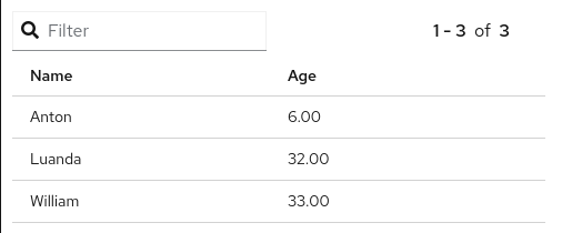
A powerful dataset lookup feature is filtering. To use this capability it is necessary to provide the column, the filter function and the args for the filter. The supported functions are (in parentheses is the number of required parameters):
-
IS_NULL(0)
-
NOT_NULL(0)
-
EQUALS_TO(1)
-
NOT_EQUALS_TO(1)
-
LIKE_TO(2)
-
GREATER_THAN(1)
-
GREATER_OR_EQUALS_TO(1)
-
LOWER_THAN(1)
-
LOWER_OR_EQUALS_TO(1)
-
BETWEEN(2)
-
TIME_FRAME(1)
-
IN(1)
-
NOT_IN(1)
The filters TIME_FRAME and IN are applied only for DATE columns and LIKE_TO is only for TEXT or LABEL columns.
Here’s a GREATER_TO sample:
datasets:
- uuid: mydataset
  content: >-
            [
              ["William", 33],
              ["Luanda", 32],
              ["Anton", 6]
            ]
  columns:
    - id: Name
    - id: Age
      type: NUMBER
pages:
- components:
    - displayer:
        lookup:
            uuid: mydataset
            filter:
                - column: Age
                  function: GREATER_THAN
                  args:
                    - 10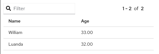
Filters can be combined using the AND logical condition, but it is possible to use logical operators AND/OR and NOT to combine filters:
datasets:
- uuid: mydataset
  content: >-
            [
              ["William", 33],
              ["Luanda", 32],
              ["Anton", 6]
            ]
  columns:
    - id: Name
    - id: Age
      type: NUMBER
pages:
- components:
    - displayer:
        lookup:
            uuid: mydataset
            filter:
                - function: OR
                  args:
                    - column: Name
                      function: LIKE_TO
                      args:
                        - "L%"
                    - column: Age
                      function: LOWER_THAN
                      args:
                        - 10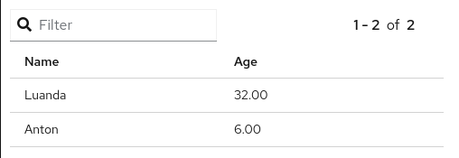
Dataset lookups also allow grouping. The group section is where the column group and the group functions are provided. The columnGroup is used to specify the grouping column and the “groupFunctions” is used to specify the group function for each selected column. In the example below the dataset lookup sums the number of products per section:
datasets:
- uuid: products
  content: >-
            [
              ["Computers", "Scanner", 5],
              ["Computers", "Printer", 7],
              ["Computers", "Laptop", 3],
              ["Electronics", "Camera", 10],
              ["Electronics", "Headphones", 5]
            ]
  columns:
    - id: Section
    - id: Name
    - id: Quantity
      type: NUMBER
pages:
- components:
    - displayer:
        lookup:
            uuid: products
            group:
                - columnGroup:
                    source: Section
                  groupFunctions:
                    - source: Section
                    - source: Quantity
                      function: SUM
                      column: Total Products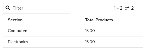
The supported group functions are SUM, MAX, MIN , AVERAGE and MEDIAN for numbers. For label columns the supported functions are DISTINCT, COUNT, JOIN, JOIN_COMMA and JOIN_HYPHEN.
By default it uses the column name itself, it is also possible to give another name to the grouped column.
If a column is not specific in columnGroup, but used with other columns in columnFunctions, then the error Error during dataset lookup: No aggregation function specified for the column is displayed.
Here’s a summary of all supported group functions:
-
MEDIAN: A group function for number columns and it calculates the median value.
-
JOIN: It joins text/label columns using space.
-
JOIN_COMMA: It is same as
JOINbut uses a comma. -
JOIN_HYPHEN: It is same as
JOINbut uses a hyphen.
However, it is possible to omit the column group section and use no function for columns under columnGroup, this way the columns will just be passed to the displayer
datasets:
- uuid: products
  content: >-
            [
              ["Computers", "Scanner", 5],
              ["Computers", "Printer", 7],
              ["Computers", "Laptop", 3],
              ["Electronics", "Camera", 10],
              ["Electronics", "Headphones", 5]
            ]
  columns:
    - id: Section
    - id: Name
    - id: Quantity
      type: NUMBER
pages:
- components:
    - displayer:
        lookup:
            uuid: products
            group:
                - functions:
                    - source: Name
                    - source: Quantity
5.4. Displayers
Displayers are visual components that can show data. Dashbuilder supports by default all the popular charts types, tables, metrics with customized structure and style, data selectors to filter the whole visualization and finally external displayers, which are custom applications used to display data.
Dashbuilder consider as displayer every component with a settings, so when the settings is declared then the type must be declared as well (we can also use displayer instead of settings):
datasets:
- uuid: products
  content: >-
            [
              ["Computers", "Scanner", 5],
              ["Computers", "Printer", 7],
              ["Computers", "Laptop", 3],
              ["Electronics", "Camera", 10],
              ["Electronics", "Headphones", 5]
            ]
  columns:
    - id: Section
    - id: Name
    - id: Quantity
      type: NUMBER
pages:
- components:
    - displayer:
        lookup:
            uuid: products
User data filtering
All displayers can filter itself and filter others using filter capabilities. This is done using the “filter” attribute, the filter must be enabled and components that will be filtered must have notification on. Components can filter itself, here’s a table filtering itself:
datasets:
- uuid: products
  content: >-
            [
              ["Computers", "Scanner", 5],
              ["Computers", "Printer", 7],
              ["Computers", "Laptop", 3],
              ["Electronics", "Camera", 10],
              ["Electronics", "Headphones", 5]
            ]
pages:
- components:
    - displayer:
        filter:
            selfapply: true
        lookup:
            uuid: products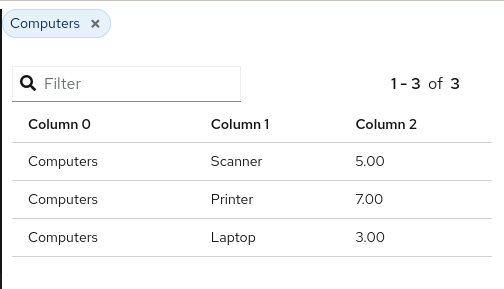
To filter other components notification must be true and other components receiving the filter should have listening as true. Here’s a table filtering each other:
datasets:
- uuid: products
  content: >-
            [
              ["Computers", "Scanner", 5],
              ["Computers", "Printer", 7],
              ["Computers", "Laptop", 3],
              ["Electronics", "Camera", 10],
              ["Electronics", "Headphones", 5]
            ]
pages:
- components:
    - displayer:
        filter:
            notification: true
        lookup:
            uuid: products
    - displayer:
        filter:
          listening: true
        lookup:
          uuid: products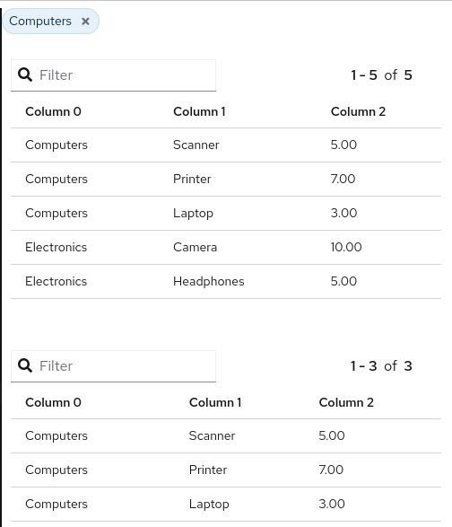
Refreshing data
It is possible to constantly refresh a Displayer with data. In this case just declare a refresh with interval and the dataset will be retrieved each X seconds.
datasets:
- uuid: products
  content: >-
            [
              ["Computers", "Scanner", 5],
              ["Computers", "Printer", 7],
              ["Computers", "Laptop", 3],
              ["Electronics", "Camera", 10],
              ["Electronics", "Headphones", 5]
            ]
pages:
- components:
    - displayer:
        refresh:
          interval: 30
        lookup:
          uuid: products
| Bear in mind that smaller refresh intervals in multiple Displayers will impact the visualization performance. |
Columns formatting
Displayers individually support dataset columns formatting. The field “columns” accept an array of columns where the id is provided, with it it is possible to change the column name, apply a number pattern and use Javascript to transform the column value. In the following example the column 0 is transformed to be upper case and the number column is formatted to use no decimal places
datasets:
- uuid: products
  content: >-
            [
              ["Computers", "Scanner", 5],
              ["Computers", "Printer", 7],
              ["Computers", "Laptop", 3],
              ["Electronics", "Camera", 10],
              ["Electronics", "Headphones", 5]
            ]
pages:
- components:
    - displayer:
        columns:
          - id: Column 0
            name: Section
            expression: value.toUpperCase()
          - id: Column 1
            name: Product
          - id: Column 2
            name: Quantity
            pattern: '#'
        lookup:
          uuid: products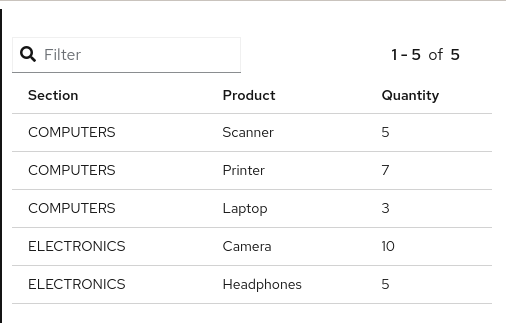
Table Settings
When using the table displayer there are specific settings that can be used:
-
pageSize: the quantity of items displayed per page;
Here’s an example of these two properties:
datasets:
- uuid: products
  content: >-
            [
              ["Computers", "Scanner", 5],
              ["Computers", "Printer", 7],
              ["Computers", "Laptop", 3],
              ["Electronics", "Camera", 10],
              ["Electronics", "Headphones", 5]
            ]
pages:
- components:
    - displayer:
        table:
            pageSize: 3
        lookup:
            uuid: products
Displayers have the following fields:
-
PNG export: the field png under export will allow users to export the displayer to PNG.
-
extraConfiguration: A top level displayer additional configuration sent to the renderer. It varies according to the renderer. For example, the echarts option can be used sent in json format using this field.
-
subTitle: A subtitle for the chart. It goes under general object.
-
allowEdit: Under general object and allow users to modify data displayed on the chart.
5.5. Using Charts
In Dashbuilder the following charts are supported:
-
BARCHART: with subtypes
COLUMN(default) andBAR. It is also possible to useSTACKED(COLUMN_STACKEDandBAR_STACKED) -
LINECHART: with subtypes
LINE(default) andSMOOTH -
AREACHART: with subtypes
AREA(default) andAREA_STACKED -
PIECHART: with subtypes
PIE(default) andDONUT
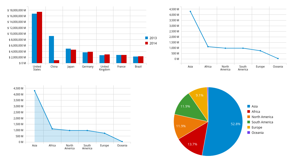
All these types support one column for categories (X axis) and at least one column for Y axis. If this is respected, then simply changing the type will change the visualization. In other words, the following YAML will render a BARCHART:
datasets:
- uuid: products
  content: >-
            [
              ["Computers", "Scanner", 5, 3],
              ["Computers", "Printer", 7, 4],
              ["Computers", "Laptop", 3, 2],
              ["Electronics", "Camera", 10, 7],
              ["Electronics", "Headphones", 5, 9]
            ]
  columns:
    - id: Section
    - id: Product
    - id: Quantity
      type: NUMBER
pages:
- components:
    - displayer:
        type: BARCHART
        lookup:
            uuid: products
            group:
                - columnGroup:
                    source: Product
                  functions:
                    - source: Product
                    - source: Quantity
                      function: SUM
                    - source: Column 3
                      function: SUM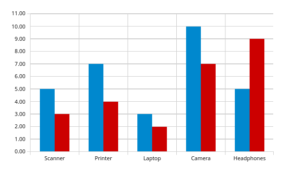
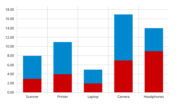
Then simply adding the subtype property with value COLUMN_STACKED it renders the following chart:
A line chart is simply a matter of changing the type to LINE:
datasets:
- uuid: products
  content: >-
            [
              ["Computers", "Scanner", 5, 3],
              ["Computers", "Printer", 7, 4],
              ["Computers", "Laptop", 3, 2],
              ["Electronics", "Camera", 10, 7],
              ["Electronics", "Headphones", 5, 9]
            ]
  columns:
    - id: Section
    - id: Product
    - id: Quantity
      type: NUMBER
pages:
- components:
    - displayer:
        type: LINECHART
        subtype: SMOOTH
        lookup:
            uuid: products
            group:
                - columnGroup:
                    source: Product
                  functions:
                    - source: Product
                    - source: Quantity
                      function: SUM
                    - source: Column 3
                      function: SUM
The same configuration could be used with AREACHART, and PIECHART (only the first column is used for the pie values).
Chart Axis configuration
It is possible to configure charts X/Y axis using the axis configuration.
Under the axis object there are two properties, x and y. Here are the supported attributes:
-
labels_show: When true the labels will be displayed.
-
title: A title for the axis.
-
labels_angle: The label’s angle. Only works for the X axis.
Chart General Settings
All charts and most of the displayers support chart general settings. These settings are part of the chart attribute:
-
width: A number with the chart fixed width. It is not a CSS property;
-
height: A number with the chart fixed height. It is not a CSS property;
-
resizable: A boolean property that indicates that the chart should auto resize according to the screen resolution. This is the only chart property that is supported by the Table displayer;
-
bgColor: The chart background color
-
margin: An object that configures the chart margin, it has the attributes left, top, bottom and right. It is not a CSS property;
-
legend: An object that configures the chart legend. It has the attributes show, when true the legend is displayed, and position, possible values are: IN, RIGHT and BOTTOM.
-
grid: An object to show/hide the grid, it has the boolean attributes x and y;
-
zoom: When true will enable zoom on charts;
-
general: In attribute
generalit is possible to set a title. The title will not be displayed, for this it is required to set the attribute show as true;
Here’s an example using chart properties:
datasets:
- uuid: products
  content: >-
            [
              ["Computers", "Printer", 7, 4],
              ["Computers", "Laptop", 3, 2],
              ["Electronics", "Camera", 10, 7],
              ["Electronics", "Headphones", 5, 9]
            ]
  columns:
    - id: Section
    - id: Product
    - id: Quantity1
      type: NUMBER
    - id: Quantity2
      type: NUMBER
pages:
- components:
    - displayer:
        type: BARCHART
        chart:
            bgColor: DEDEDE
            width: 800
            height: 400
            zoom: true
            margin:
                right: 50
                top: 50
            legend:
                show: true
                position: bottom
            grid:
                x: false
                y: false
        lookup:
            uuid: products
            group:
            - columnGroup:
                source: Product
              functions:
                - source: Product
                - source: Quantity1
                  function: SUM
                - source: Quantity2
                  function: SUM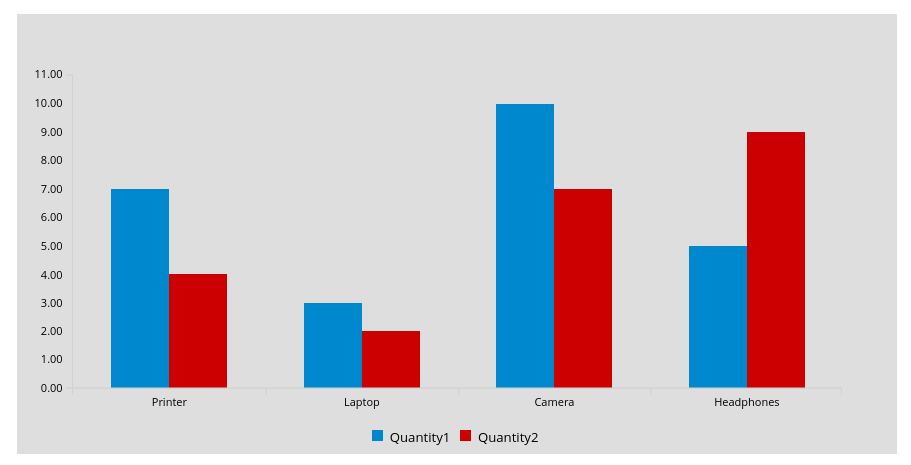
5.6. Selectors
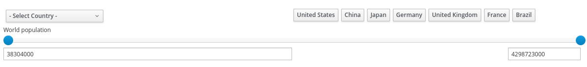
Selector is a special displayer type used to filter the visualization. It has 3 subtytpes:
-
SELECTOR_LABELS: Shows the values in selectable labels; -
SELECTOR_DROPDOWN: Shows the values in a dropdown; -
The default subtype is a select
| Filter must be enabled, otherwise selectors will not work. |
Here’s an example of labels selector:
datasets:
- uuid: products
  content: >-
            [
              ["Computers", "Printer", 7, 4],
              ["Computers", "Laptop", 3, 2],
              ["Electronics", "Camera", 10, 7],
              ["Electronics", "Headphones", 5, 9]
            ]
  columns:
    - id: Section
    - id: Product
    - id: Quantity1
      type: NUMBER
    - id: Quantity2
      type: NUMBER
pages:
- components:
    - displayer:
        type: BARCHART
        filter:
            listening: true
        lookup:
            uuid: products
            group:
            - columnGroup:
                source: Product
              functions:
                - source: Product
                - source: Quantity1
                  function: SUM
                - source: Quantity2
                  function: SUM
    - displayer:
        type: SELECTOR
        subtype: SELECTOR_LABELS
        selector:
            multiple: true
        filter:
            notification: true
        lookup:
            uuid: products
            group:
            - columnGroup:
                source: Section
              functions:
                - source: Section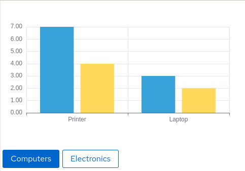
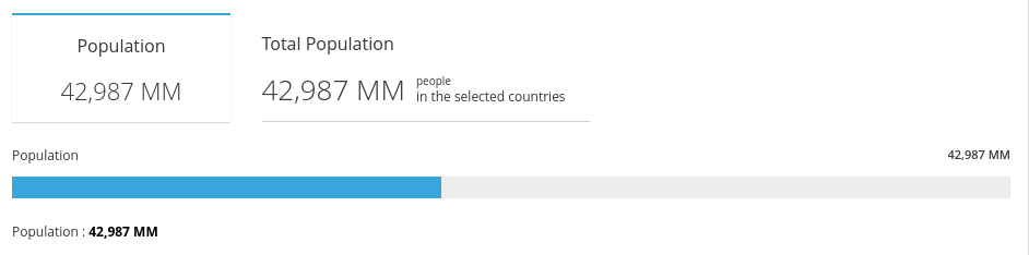
5.7. Metrics
The metric component is a piece of HTML capable of showing a single value. It is possible to customize the HTML, but by default the value is displayed in a card:
datasets:
- uuid: products
  content: >-
            [
              ["Printer", 7],
              ["Laptop", 3],
              ["Camera", 10],
              ["Headphones", 5]
            ]
  columns:
    - id: Product
    - id: Quantity
      type: NUMBER
pages:
- components:
    - displayer:
        type: METRIC
        chart:
            height: 100
            width: 150
        general:
            title: Total Products
        lookup:
            uuid: products
            group:
            - functions:
                - source: Quantity
                  function: SUM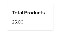
The HTML can be customized using the object html with the field html and javascript for javascript. Inside the HTML the variable ${value} contains the value resulted from the dataset lookup and to refer to elements in javascript give the element the id ${this} and refer to it in the javascript code. Be responsible for the javascript code used in the YAML!
Here’s a basic example:
datasets:
- uuid: products
content: >-
[
["Printer", 7],
["Laptop", 3],
["Camera", 10],
["Headphones", 5]
]
columns:
- id: Product
- id: Quantity
type: NUMBER
pages:
- components:
- displayer:
type: METRIC
html:
html: <h2><strong>✪ Total Products:</strong> <span id="${this}">${value}</span></h2>
javascript: >-
${this}.onmouseover = function() {
${this}.style.color = "red";
};
${this}.onmouseout = function() {
${this}.style.color = "black";
};
lookup:
uuid: products
group:
- functions:
- source: Quantity
function: SUM
Other variables from the displayer configuration can be used in the code (using ${variable name} template): title, width, height, marginTop, marginBottom, marginRight, marginLeft and bgColor.
5.8. Meter Chart
A special chart is the meter chart. It compares values and shows the percent of the total. To configure the value’s boundaries use the property meter, it supports the following attributes:
-
start: a value to start the meter
-
end: the max value for the meter
-
critical: paints the meter as red if the value is bigger than this parameter
-
warning: paints the meter as orange if the value is bigger than this parameter
For the dataset it accepts two columns: the label and the value. Here’s an example:
datasets:
- uuid: memory_usage
  content: >-
            [
              ["Server 1", 2512],
              ["Server 2", 1900],
              ["Server 3", 3200],
              ["Server 4", 1200]
            ]
  columns:
    - id: Server
    - id: Usage
      type: NUMBER
pages:
- components:
    - properties:
        font-size: xx-large
        text-align: center
      settings:
        type: METERCHART
        general:
            title: "Memory Usage"
        chart:
            legend:
                show: true
                position: bottom
        meter:
            end: 4120
            critical: 3000
            warning: 2000
        lookup:
            uuid: memory_usage
            group:
            - columnGroup:
                source: Server
              functions:
                - source: Server
                - source: Usage
                  function: SUM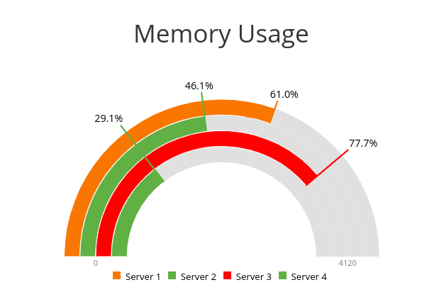
5.9. Map
| Map is disabled for ECharts renderer and may be available in later versions. |
Dashbuilder provides a Map component to show geographic data. It is country based, so to use it one must provide the country identification, which could be the country name, lat, long or the country code, and provide the value for that country.
It has two types:
* MAP_MARKERS: which marks the country with bubbles according to the value
* MAP_REGIONS: which paints the map according to the value.
The only specific configuration for map is color_scheme, which could have the values red, green or blue and it is an attribute of object map. Here’s an example:
datasets:
- uuid: countries
  content: >-
            [
              ["Brazil", 2512],
              ["USA", 1900],
              ["Italy", 3200],
              ["Russia", 1200],
              ["China", 100],
              ["Australia", 1000],
            ]
  columns:
    - id: Server
    - id: Usage
      type: NUMBER
pages:
- components:
    - displayer:
        type: MAP
        map:
            color_scheme: blue
        lookup:
            uuid: countries
            group:
            - columnGroup:
                source: Server
              functions:
                - source: Server
                - source: Usage
    - displayer:
        type: MAP
        subtype: MAP_MARKERS
        map:
          color_scheme: red
        lookup:
            uuid: countries
            group:
            - columnGroup:
                source: Server
              functions:
                - source: Server
                - source: Usage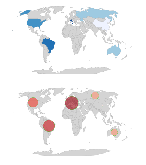
5.10. External Components
Dashbuilder also support components built externally. Components have an ID and you can either add its assets to Dashbuilder server under context /dashbuilder/component/{componentId}/ or use a property to point to a remote component:
datasets:
  - uuid: products
    content: >-
      [
        ["Computers", "Scanner", 5, 3],
        ["Computers", "Printer", 7, 4],
        ["Computers", "Laptop", 3, 2],
        ["Electronics", "Camera", 10, 7],
        ["Electronics", "Headphones", 5, 9]
      ]
    columns:
      - id: Section
      - id: Product
      - id: Quantity
        type: NUMBER
      - id: Quantity2
        type: NUMBER
pages:
  - components:
      - displayer:
          component: simplest_component
          simplest_component:
            name: "John"
            age: "33"
          external:
            baseUrl: https://jesuino.github.io/components/
            width: 100%
            height: 600px
          lookup:
            uuid: products
Some components are provided for use with Dashbuilder. Check the documentation for each component to understand how to use it:
-
table: The table external component has a different look and feel and can be used with any dataset.
datasets:
  - uuid: products
    content: >-
      [
        ["Computers", "Scanner", 5, 3],
        ["Computers", "Printer", 7, 4],
        ["Computers", "Laptop", 3, 2],
        ["Electronics", "Camera", 10, 7],
        ["Electronics", "Headphones", 5, 9]
      ]
pages:
  - components:
      - displayer:
          component: table
          external:
            width: 100%
          lookup:
            uuid: products
-
echarts: ECharts chart. In this component the dataset is transformed to an echarts dataset and the
optionparameter can be used to provide a JSON object to configure the echart. We also parse the options in YML format to JSON, so some configuration could be done using pure YML. Here’s a sample echart usage:
datasets:
  - uuid: products
    content: >-
      [
        ["Computers", "Scanner", 5, 3],
        ["Computers", "Printer", 7, 4],
        ["Computers", "Laptop", 3, 2],
        ["Electronics", "Camera", 10, 7],
        ["Electronics", "Headphones", 5, 9]
      ]
    columns:
      - id: Section
      - id: Product
      - id: Quantity
        type: NUMBER
      - id: Quantity2
        type: NUMBER
pages:
- components:
    - displayer:
        component: echarts
        echarts:
            option: >-
                    {
                        "toolbox": {
                            "feature": {
                                "dataZoom": {},
                                "magicType": {
                                    "type": ["line", "bar", "stack"]
                                },
                                "restore": {}
                            }
                        },
                        "series": [

                            {
                                "type": "bar",
                                "markLine": {
                                    "data": [
                                        { "type": "average" }

                                    ]
                                }
                            },
                            {
                                "type": "bar",
                                "markLine": {
                                    "data": [
                                        { "type": "average" }
                                    ]
                                }
                            }
                        ]

                    }
            title:
                text: Products
        external:
          width: 100%
        lookup:
          uuid: products
          group:
            - columnGroup:
                source: Product
              functions:
                - source: Product
                - source: Quantity
- source: Quantity2-
svg-heatmap: The SVG heatmap allow users to draw heat over any SVG. The provided dataset must have two columns: SVG name or id and a value for the heat. The component can have the parameters
sizeandblurto control the heat appearance:
datasets:
  - uuid: svg-data
    content: >-
      [
        ["svg_1", 1],
        ["svg_2", 2],
        ["svg_3", 3],
        ["svg_4", 4],
        ["svg_5", 5],
        ["svg_6", 6]
      ]
pages:
  - components:
      - displayer:
          component: svg-heatmap
          external:
            width: 100%
          svg-heatmap:
            size: "3"
            blur: "0.9"
            svg: >-
              <svg xmlns="http://www.w3.org/2000/svg">
                <path id="svg_1" d="m23,23l82,0l0,51l-82,0l0,-51z" stroke-width="0" fill="#999999"/>
                <path id="svg_2" d="m133,23l82,0l0,51l-82,0l0,-51z" stroke-width="0" fill="#999999"/>
                <path id="svg_3" d="m240,23l82,0l0,51l-82,0l0,-51z" stroke-width="0" fill="#999999"/>
                <path id="svg_4" d="m350,23l82,0l0,51l-82,0l0,-51z" stroke-width="0" fill="#999999"/>
                <path id="svg_5" d="m461,24l82,0l0,51l-82,0l0,-51z" stroke-width="0" fill="#999999"/>
                <path id="svg_6" d="m566,26l82,0l0,51l-82,0l0,-51z" stroke-width="0" fill="#999999"/>
              </svg>
          lookup:
uuid: svg-data-
uniforms: Uniforms is a component that does not use a dataset, but allow users to render forms to post data to a URL. It accepts the parameters
uniforms.url, the form URL and the JSON schema for the form generation,uniforms.schema.
pages:
  - components:
      - type: EXTERNAL
        properties:
          height: 500px
          componentId: uniforms
          uniforms.url: http://acme.com
          uniforms.schema: >-
            {
               "title":"",
               "type":"object",
               "properties":{
                  "workflowdata": {
                      "title": "Sample Form",
                      "default": { "language": "English", "name": "John" },
                      "type": "object",
                      "properties": {
                          "name":{
                             "type":"string"
                          },
                          "language":{
                             "type":"string",
                             "allowedValues": ["English", "Spanish"]
                          }
                      },
                      "required":[
                         "name", "language"
                      ]
                  }

               }
}-
map: Map is a component to show geographic information. It is based on react-simple-map library and accepts different configuration related to the map aspect. The dataset can be the geo name/some key for the geo and a value or three number columns with the latitute, longitude and the value. It can show the data in bubbles or fill the matched geo.
datasets:
    - uuid: data
      content: >-
                [
                    ["SP", 1],
                    ["RJ", 90],
                    ["MG", 5],
                    ["PA", 50],
                    ["AM", 2],
                    ["RS", 100]
                ]
      columns:
          - id: name
          - id: value
            type: NUMBER
pages:
    - components:
          - displayer:
                component: map
                map:
                    geoUrl: https://raw.githubusercontent.com/sjcdigital/geo-json/main/Brasil.json
                    enableZoom: "true"
                    minZoom: "1"
                    maxZoom: "20"
                    zoom: "2"
                    fill: white
                    background: lightgray
                    strokeWidth: "0.2"
                    zoomCenterLat: "-28.749997"
                    zoomCenterLong: "-47.9499962"
                    fillBegin: lightgreen
                    fillEnd: darkgreen
                    geoKey: "UF"
                external:
                    width: 100%
                    height: 800px
                lookup:
                    uuid: data
                    group:
                        - functions:
                              - source: name
                              - source: value
5.11. Navigation
It is possible to have multiple pages in a single visualization. The pages can be organized in a menu using navigation. When you don’t declare a navigation then a standard menu navigation is used:
pages:
    - name: Cats
      components:
        - html: <h1> Cats </h1>
    - name: Dogs
      components:
        - html: <h1>Dogs</h1>
    - name: Tablets
      components:
        - html: <h1>Tablets</h1>
    - name: Laptops
      components:
        - html: <h1>Laptops</h1>
The section navTree is responsible for declaring the navigation tree and the navigation groups for the pages is possible to organize the menus in navigation groups. Here’s an example:
pages:
    - name: Cats
      components:
        - html: <h1> Cats </h1>
    - name: Dogs
      components:
        - html: <h1>Dogs</h1>
    - name: Tablets
      components:
        - html: <h1>Tablets</h1>
    - name: Laptops
      components:
        - html: <h1>Laptops</h1>
navTree:
  root_items:
  - type: GROUP
    name: Animals
    children:
    - page: Cats
    - page: Dogs
  - type: GROUP
    name: Electronics
    children:
    - page: Tablets
    - page: Laptops
Navigation is an optional component and it is about the relationship between pages. When you have more than one page then a menu is displayed with all pages, you can organize this menu. Furthermore, navigation is the key for embedding pages inside each other.
To show a default page just name it as index and it will be displayed by default, otherwise the default Dashbuilder page will be displayed.
|
5.12. Navigation Components
It is possible to embed pages using navigation groups. To do so Dashbuilder provides navigation components.
-
TILES: Displays the navigation group pages in tiles;
-
CAROUSEL: Displays the pages in a carousel;
-
TREE: Displays a tree with the pages. It requires a target DIV;
-
MENU: Displays a menu with the pages. It requires a target DIV;
-
TABS: Displays tabs with the pages. It requires a target DIV;
-
SCREEN: A component that shows other page. Uses it with:
screen: embedPageName; -
PANEL: A component that shows other page in a collapsible panel. Uses it with:
panel: embedPageName -
DIV: A div that shows the content for TREE, MENU and TABS components.
A property called navGroupId should be set to point to the same groupId declared in navigation. For components that require a div, then a DIV component should be placed on the page and the div ID should be referenced using the property divId.
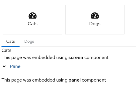
Here’s an example of navigation components:
pages:
    - name: Embed
      components:
          - html: This page was embedded using <strong>screen</strong> component
    - name: Panel
      components:
          - html: This page was embedded using <strong>panel</strong> component
    - name: Cats
      components:
        - html: <h1> Cats </h1>
    - name: Dogs
      components:
        - html: <h1>Dogs</h1>
    - name: index
      properties:
        margin-left: 10px
      rows:
        - columns:
          - components:
            - type: TILES  # try CAROUSEL
              properties:
                navGroupId: animals_group
        - columns:
          - components:
            - type: TABS  # try MENU or TREE
              properties:
                navGroupId: animals_group
                targetDivId: animals_div
            - type: DIV
              properties:
                divId: animals_div
            - screen: Embed
            - panel: Panel
navTree:
  root_items:
  - id: animals_group
    type: GROUP
    name: Animals
    children:
    - page: Cats
    - page: Dogs
5.13. Properties
The goal of properties is to make it easier to reuse YAML definitions and let users only customize certain parts of the document. Properties can be declared with a value and later references using ${PROPERTY NAME}.
Be careful when using ${} to avoid conflicts with Metric templates.
|
Properties are meant to be used only with field values. Here’s an example:
properties:
    My Property: <h1>Hello Properties</h1>
pages:
    - name: Cats
      components:
        - html: ${My Property}
When running on Dashbuilder you can also override the properties using query parameters. In the example above My Property could be changed using http://my.dashbuilder?My Property=New Property value.
5.14. Global
Global section was added in 0.26.0 version and it allows users to change the dashboard default mode to dark and declare a global settings for all displayers on the page or a global setting for all dataset or a global dataset:
global:
  mode: dark
  dataset:
    content: >-
      [
          ["A", 1],
          ["B", 2]
      ]
  settings:
    general:
      title: Common Title
datasets:
  - uuid: test

pages:
  - rows:
      - columns:
          - span: 6
            components:
              - displayer:
                  type: BARCHART
                  lookup:
                    uuid: test
          - span: 6
            components:
              - displayer:
                  type: LINECHART
                  lookup:
                    uuid: test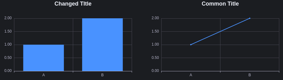
The supported global properties are:
-
allowUrlProperties: When true then properties can be replaced using URL query parameters.
-
mode: Changes the dashboard style. Can be dark or light. Default value is light.
-
settings/displayer: Allow the users to define a common configuration for all displayers in the page.
-
dataset: Allow the users to define a common configuration for all displayers in the page.
6. Monitoring Services with Dashbuilder
In this section we will explore how Dashbuilder can be used to monitor different aspect of services.
6.1. Prometheus
Prometheus is a popular monitoring and timeseries database tool. Dashbuilder can connect to its Query HTTP API and execute queries to retrieve information that can be displayed in timeseries or other visual components.
The requirements to consume data from Prometheus in Dashbuilder are:
-
Make sure that CORS is enabled for the Dashbuilder host, otherwise it won’t be able to retrieve data;
-
Use a dataset with type prometheus for Dashbuilder 0.29.0 and later versions. See an example:
datasets:
    - uuid: prometheus
      type: prometheus
      url: http://localhost:9090/api/v1/query?query=up

pages:
    - components:
          - settings:
                lookup:
                    uuid: prometheus
This expression will get the response and transform in a dataset that will contain the columns timestamp, value and the additional labels. With this information you can use a timeseries component to monitor some metric.
As an example, we can monitor a Quarkus application JVM usage by following the steps below:
-
Add Micrometer to your project
-
Download and configure Prometheus to scrap metrics from your application. Here’s a sample configuration you should add to prometheus.yml:
  - job_name: 'quarkus'
    scrape_interval: 1s
    metrics_path: /q/metrics
    static_configs:
- targets: ['localhost:8080']-
Now use Dashbuilder online editor, create a new Dashboard. For example, the following dashboard shows a timeseries for the JVM Heap usage for the last hour. The data is updated each 5 seconds:
properties:
    prometheusUrl: http://localhost:9090
datasets:
    - uuid: prometheus
      type: prometheus
      url: ${prometheusUrl}/api/v1/query
      query:
          query: jvm_memory_used_bytes{area="heap"}[1h:5s]
pages:
    - components:
          - settings:
                type: TIMESERIES
                chart:
                    resizable: true
                refresh:
                    interval: 5
                general:
                    title: JVM Memory (Used Heap)
                lookup:
                    uuid: prometheus
                    group:
                        - functions:
                              - source: id
                              - source: timestamp
                              - source: value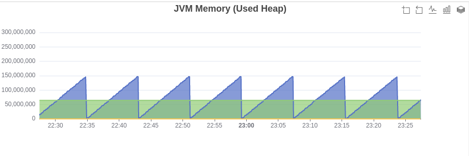
6.2. Metrics
Services monitored by Prometheus have to expose its metrics in a text format. Prometheus then read these metrics to store in its timeseries database. Dashbuilder can be used to connect directly to the metrics endpoint and build visualizations using it.
As an example, an application Quarkus with micrometer will expose metrics on url /q/metrics with the following format:
# HELP process_start_time_seconds Start time of the process since unix epoch.
# TYPE process_start_time_seconds gauge
process_start_time_seconds 1.684330722622E9
# HELP jvm_threads_live_threads The current number of live threads including both daemon and non-daemon threads
# TYPE jvm_threads_live_threads gauge
jvm_threads_live_threads 26.0
# HELP process_files_max_files The maximum file descriptor count
# TYPE process_files_max_files gauge
process_files_max_files 100000.0
# HELP jvm_memory_max_bytes The maximum amount of memory in bytes that can be used for memory management
# TYPE jvm_memory_max_bytes gauge
jvm_memory_max_bytes{area="heap",id="G1 Survivor Space",} -1.0
jvm_memory_max_bytes{area="heap",id="G1 Old Gen",} 8.350859264E9
jvm_memory_max_bytes{area="nonheap",id="Metaspace",} -1.0
jvm_memory_max_bytes{area="nonheap",id="CodeCache",} 5.0331648E7
jvm_memory_max_bytes{area="heap",id="G1 Eden Space",} -1.0
jvm_memory_max_bytes{area="nonheap",id="Compressed Class Space",} 1.073741824E9
# HELP jvm_threads_states_threads The current number of threads
# TYPE jvm_threads_states_threads gauge
jvm_threads_states_threads{state="runnable",} 11.0
jvm_threads_states_threads{state="blocked",} 0.0
jvm_threads_states_threads{state="waiting",} 11.0
jvm_threads_states_threads{state="timed-waiting",} 4.0
jvm_threads_states_threads{state="new",} 0.0
jvm_threads_states_threads{state="terminated",} 0.0
# HELP process_cpu_usage The "recent cpu usage" for the Java Virtual Machine process
It is possible to declare a dataset pointing to this URL and Dashbuilder automatically parses it to a dataset with three columns: metric, labels and value:
datasets:
  - uuid: metrics
    url: http://localhost:8080/q/metrics
pages:
    - components:
        - settings:
            lookup:
              uuid: metrics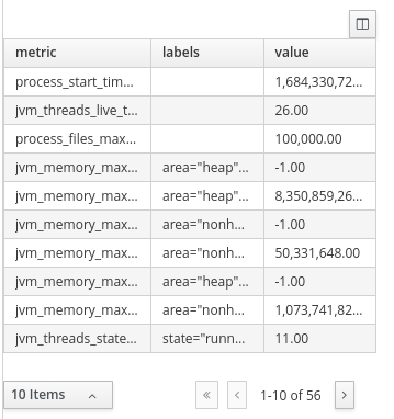
From this dataset you can monitor each metric you want either by filtering metrics using an expression or defining filters on the displayer lookup. In the following example we want to monitor the metric jvm_memory_used_bytes, but only the heap area
datasets:
    - uuid: metrics
      url: http://localhost:8080/q/metrics
pages:
    - components:
          - settings:
                type: BARCHART

                general:
                    title: Heap Memory Used Bytes (kb)
                columns:
                    - id: value
                      pattern: "#"
                      expression: value / 1024
                    - id: labels
                      expression: value.replace('area="heap",id=', "")
                                       .replaceAll('"', "")
                lookup:
                    uuid: metrics
                    filter:
                        - function: EQUALS_TO
                          column: metric
                          args:
                              - jvm_memory_used_bytes
                        - function: LIKE_TO
                          column: labels
                          args:
                              - '%"heap"%'
                    group:
                        - columnGroup:
                              source: labels
                          functions:
                              - source: labels
                              - source: value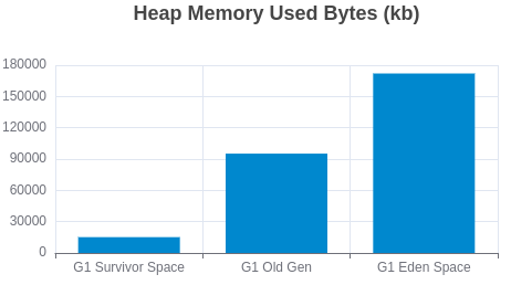
Finally you can make the visualization update automatically using a refresh interval and also accumulate values in memory using the accumulate flag in dataset declaration. This way you keep a history of the events and can use a timeseries to visualize the data, here’s an example:
global:
    settings:
        refresh:
            interval: 2
datasets:
    - uuid: metrics
      url: http://localhost:8080/q/metrics
      accumulate: true
      cacheMaxRows: 30000
      expression: >-
          $map($, function($v){
              [$v[0], $v[1], $v[2] = 'NaN' ? -1 : $v[2], $now() ~> $toMillis()]
          })
      columns:
          - id: metric
            type: label
          - id: labels
            type: label
          - id: value
            type: number
          - id: register
            type: label
pages:
    - components:
          - settings:
                component: timeseries
                timeseries:
                    title:
                        text: Heap Memory Usage
                lookup:
                    uuid: metrics
                    filter:
                        - column: metric
                          function: EQUALS_TO
                          args:
                              - jvm_memory_used_bytes
                        - column: labels
                          function: LIKE_TO
                          args:
                              - '%area="heap"%'
                    group:
                        - columnGroup:
                              source: register
                          groupFunctions:
                              - source: metric
                              - source: register
                              - source: value
function: SUMYou can check our samples repository for more metrics monitoring examples.